OneBridge
A human-centered HR platform for the moments that matter most — joining a company, and leaving it.
The Brief
Onebridge is a web-based HR platform built around onboarding and offboarding — organizing the practical tasks that surround someone's first and last days at a company. Getting a phone, booking meetings, completing paperwork. The reversed process when they leave.
I joined as a freelance designer with a loose brief: take some early internal designs, be liberal with them, and establish a visual identity from scratch. That meant logo, color system, design tokens, a component library, and a set of developer-ready content blocks for the CMS.
There was no mobile or desktop scope — web only — and no established brand to work from. Just a product, a name, and a direction.
The Timeline
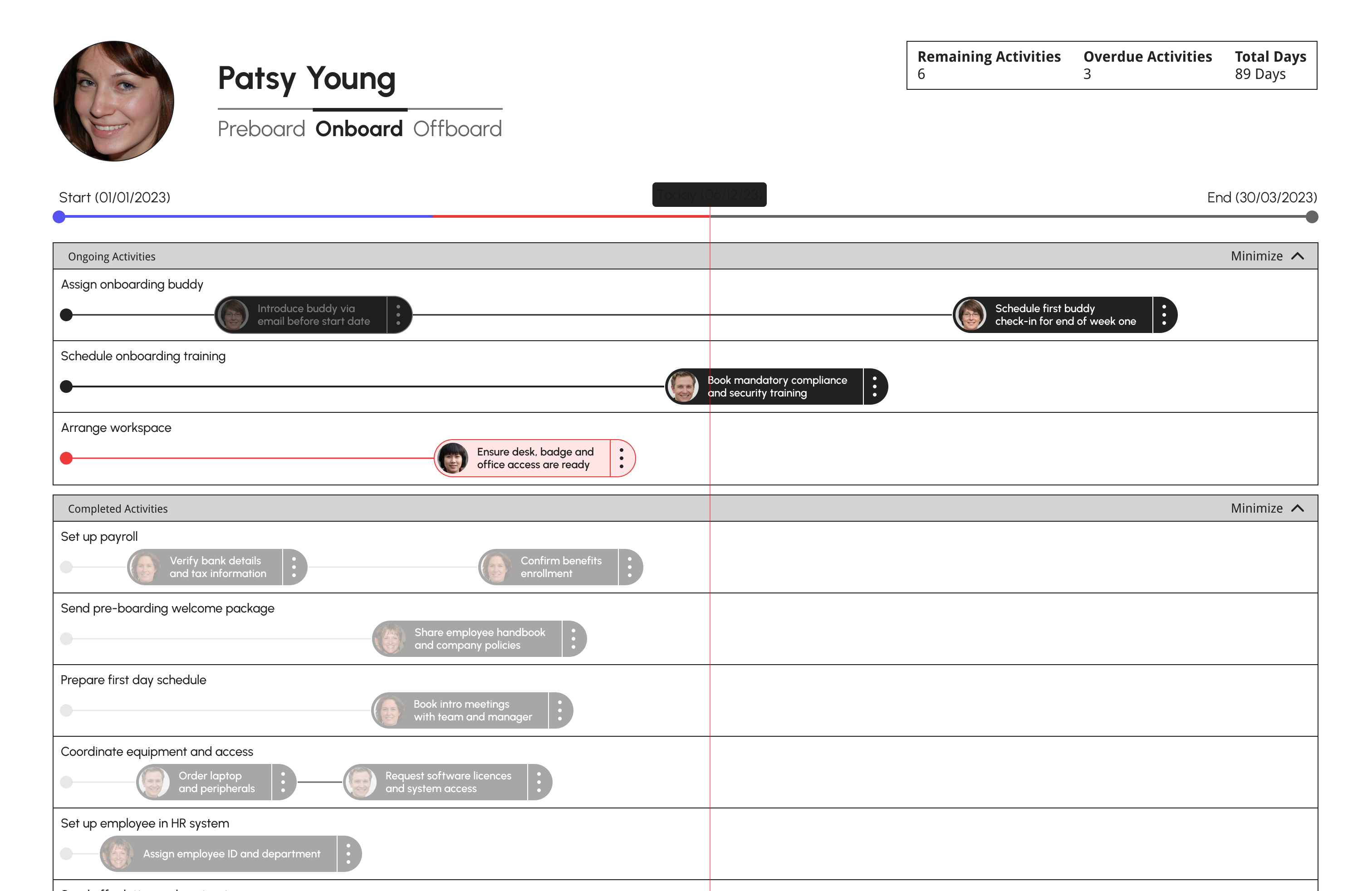
The core feature of OneBridge was a timeline — a visual overview of all tasks in an onboarding or offboarding process. On the surface straightforward, in practice complex.
My first attempt was a node-based system. It mapped relationships clearly but fell apart at scale — too cluttered, and time wasn't communicated well enough for something where deadlines were central. See the concept wireframe below:
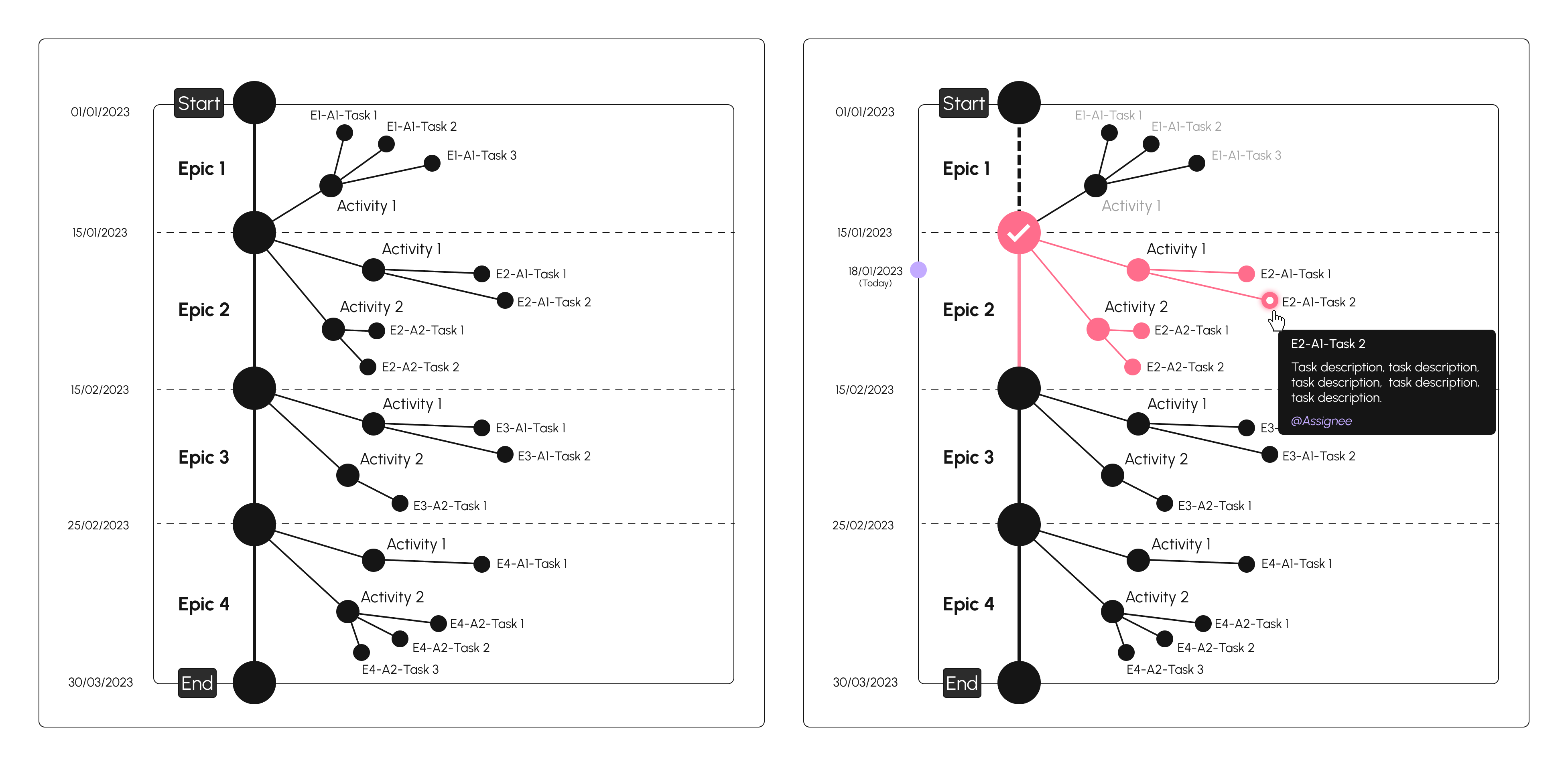
I pivoted to a timeline with three challenges to solve. Ratio: activities varied wildly in duration, so the view normalizes to a correct time ratio, with deadline-free activities separated into their own floating section. Hierarchy: activities are grouped and collapsible, with dependent tasks branching visually from where they begin. Ownership: each activity has one owner, with an actions list inside for tagging others who need to be involved. See the updated concept wireframe below:
The timeline was ultimately not shipped — the client decided it was too complex for their current needs. The design solved the problem I was given, but products change direction. Shipped work and good work aren't always the same thing.
The Design Direction
HR tools tend to feel cold. Clinical colors, dense interfaces, the aesthetic of compliance software. Onebridge was different in purpose — it's a product for people working with people, built around some of the most human moments in a working life.
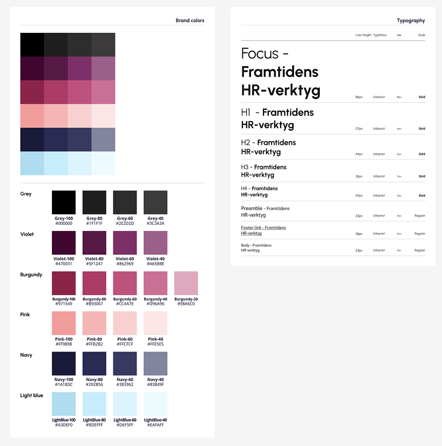
That shaped every visual decision. I landed on a warm palette of pinks and soft tones, deliberately chosen to feel professional but inviting. Not overwhelming. The kind of interface that feels instantly recognizable without needing to be learned.
The goal was simple: when someone opens this for the first time, it should feel like it was made for them.
The Logo
The name "Onebridge" carried a clear concept — a bridge connecting companies with the people joining or leaving them. I explored that direction thoroughly, iterating on bridge-based marks across many variations.
I came to the client with a primary direction and several alternatives. They chose one of the alternatives — a geometric cluster, cleaner and more versatile than the bridge concept. That's a normal part of the process. I took that direction and developed it further, exploring color combinations across the mark and testing how they held up across the block designs I was building in parallel.
Design System & Developer Blocks
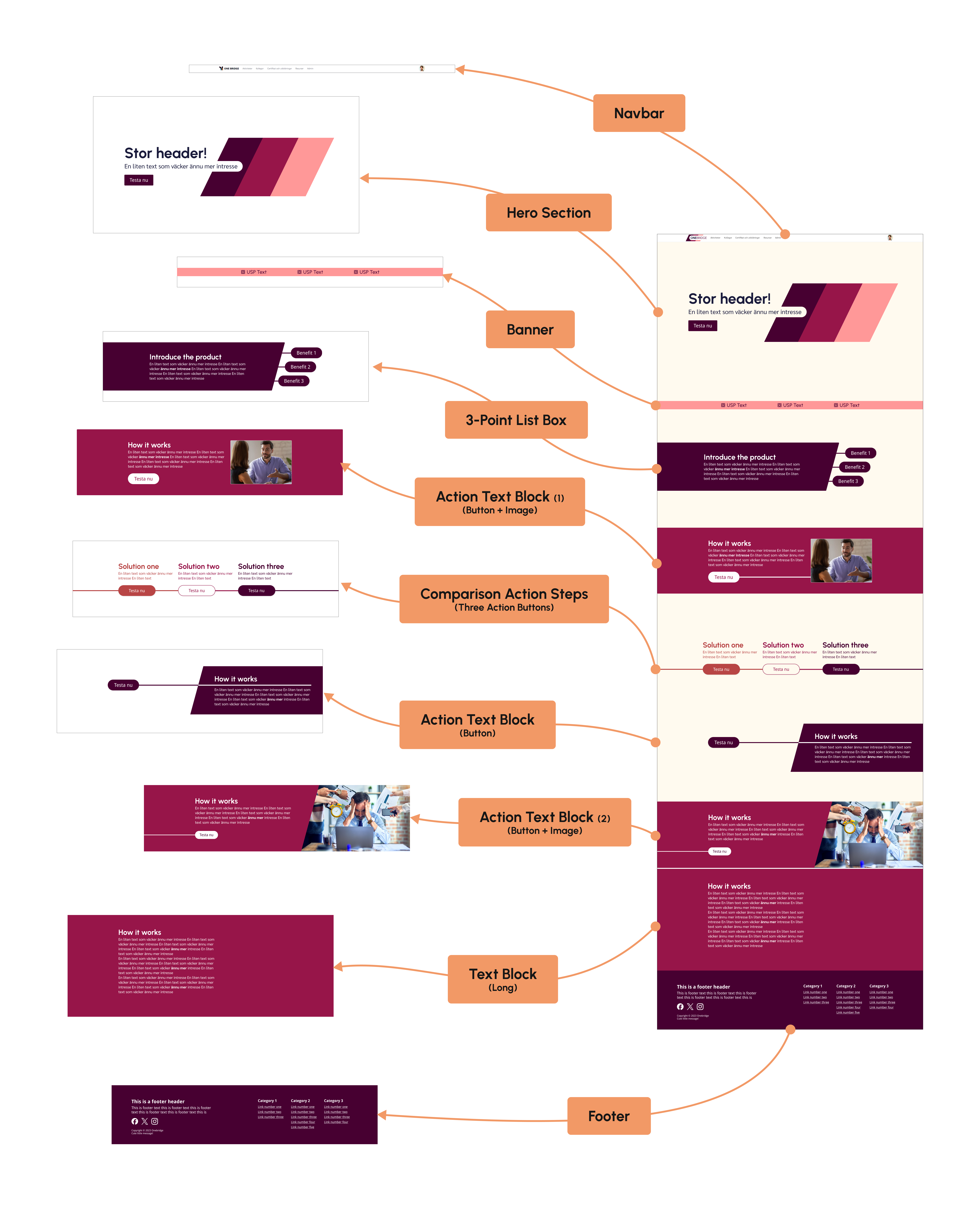
With the visual identity established I built a full design token system and component library in Figma — typography, color, spacing, iconography — everything the development team would need to build consistently without having to interpret design decisions themselves.
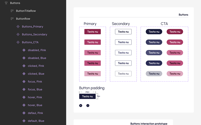
On top of that I created a set of block types: modular, reusable content sections that used the design system and gave the team a flexible but structured toolkit for building out the platform. The goal was to make content management simple without sacrificing visual consistency.
End
Freelance work has a particular kind of pressure — you come in without context, you leave before the product is finished, and everything you build has to be good enough to hand over to someone who wasn't in the room when you made the decisions. The scope here was tight and the brief was loose, which is its own kind of challenge.
Starting from nothing meant every decision had weight. There was no existing brand to defer to, no visual language to extend. The foundation had to be right, because it was the only thing the team would have to build on after I left.
That's what I tried to deliver — not just assets, but a system with enough logic baked in that the next person could extend it without having to interpret it.